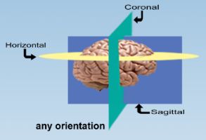
Second order stereology deals with relationships, for example the distribution of particles. The nearest neighbor probe is a method to estimate the distances between particles. The parent cells are chosen without bias since this probe is conducted along with an optical fractionator probe. For each parent cell the nearest distance to another cell is measured and a list of ‘nearest neighbor distances’ is obtained. Of course these distances will be affected by artifact shrinkage of the tissue sections, so you might want to correct for ‘z-shrinkage’. In other words if your section has shrunk in the z-direction from 60 microns to 30 microns, the z-component of all direction vectors should be doubled when you are searching for the nearest neighbor. In (Schmitz C., 2002) each z-coordinate was multiplied by the ratio of the ideal, pre-shrinkage section thickness to the real, post-shrinkage thickness (see http://www.cercor.oupjournals.org/cgi/content/full/12/9/954/DC1 ‘Stereological procedure necessary to obtain the raw data for the three dimensional analysis of the nearest neighbor distance distributions of cells inthick sections.;sixth paragraph’) before nearest neighbor distances were calculated. There is also a discussion of why the authors only corrected for z-, and not for x- or y-shrinkage.
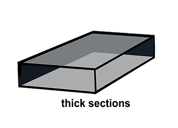
This technique requires thick sections and enough space between the disector and the guard zone such that a nearest neighbor that is above or below the disector will not be missed because it is not contained in the section. So place your disector in the middle of the section and make sure the maximum nearest neighbor distance is not greater than the distance from the top of the disector to the top of the section (or the bottom of the disector to the bottom of the section). This is discussed in the beginning of the supplementary on-line material (http://www.cercor.oupjournals.org/cgi/content/full/12/9/954/DC1) (Schmitz C 2002) in the section called ‘methodological aspects concerning the advantages of analyzing the spatial arrangement of neurons by NND distributions and EDF plots’. Schmitz used a disector that was about one-tenth the height of his sections and centered in the middle of the z-extent of the section. His maximum nearest neighbor distances turned out to be considerably less than one half of the section thickness.
Information about the distribution of the particles can be obtained from the nearest neighbor distances. From the raw data a histogram can be plotted that shows the frequency of the NNDs (http://www.cercor.oupjournals.org/cgi/content/full/12/9/954/DC1, Fig. 3B and 3E). Then a cumulative relative frequency (CRF) function (http://www.cercor.oupjournals.org/cgi/content/full/12/9/954/DC1, Fig. 3C and 3F) is graphed. A CRF graph plots the NNDs on the X-axis and the frequency of that particular NND and all NNDs smaller than it on the Y axis. To illustrate how you go from an absolute histogram to the CRF graph (Fig. 3B to 3C); let’s consider the NND of 7 microns on the abscissa. On the CRF graph (Fig. 3C) the NND of 7 microns is mapped to the sum of the frequencies read off of the histogram (Fig. 3B) that correspond to a NND of 7 microns and those that correspond to all NNDs below 7 microns. In other words, for each nnd on the X-axis, the graph shows a Y-value that indicates the probability that any particle would be that distance or less from another particle. That’s why the CRF function keeps getting bigger as you go along the x-axis, and also why the CRF y-value for the largest NND is unity. CRF graphs can be used to compare the spatial distributions of one system of particles to another (Segal D 2008), but they can’t be used to determine whether your system of particles is more dispersed or more clumped then if the same particles were randomly oriented in space. That can be attempted instead with a G-graph (see below).
Example CRF Graph and Explanation
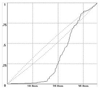
In this example of a CRF graph, the nearest neighbor distances are given on the x-axis. For this discussion, ignore the area delineated by the dotted lines. If you look at a given nnd, you can tell the probability that any particle would be that distance, or less (since it’s a cumulative frequency graph), from another particle. You can use the CRF graph to interpret the 3D arrangement of your particles. For instance, in this graph, there is a scarcity of short distances that indicates a relatively dispersed situation. If we compared this data set to another group of cells that were more clustered, the CRF would rise more rapidly because there are many short distances.
For examples with comparisons of CRF graphs of nnds, see Fig. 2 in Altered Spatial Arrangements (Schmitz et al.) or Fig. 4 in Spatial distribution and density… (Segal et al.). Apply caution when comparing CRF graphs that come from systems with different numbers of cells and/or different densities.
The G-graph (Diggle 1983) was developed as a way to compare the spacing of a given system of particles to the situation if those particles were randomly distributed (Poisson distribution). If you take the same number of particles as is in your system and put them in a volume or area such that the density is the same, you can ‘roll the dice’ and distribute these particles randomly. Then you can perform an optical fractionator/nearest neighbor on these randomly distributed particles, and come up with a CRF graph. You cannot compare the data that you have measured to just one random-CRF however, because the NNDs and the CRF for one random distribution may be quite different than that for another random distribution. For instance in Fig 3 of ‘Schmitz, et al.’, two random arrangements of the measured data are compared (http://www.cercor.oupjournals.org/cgi/content/full/12/9/954/DC1). The CRFs for these two random arrangements are different from each other. According to Diggle (Diggle 1983) it is better to compare your collected data to very many random distributions of that data (remember it is important to use the same number of cells and the same density of those cells for your random distributions, see figure 6 in http://www.cercor.oupjournals.org/cgi/content/full/12/9/954/DC1 and accompanying text). Schmitz (Schmitz C 2002) distributed these points in a two-dimensional shape (circle and square – the actual shape of the anatomical region was not used) made sure the density was the same as for the original data, and generated 99 Poisson distributions of the particles. Then an empirical distribution graph was made. To make this graph, called a G-graph, the 99 Poisson distributions of the particles each had a nearest neighbor probe conducted on it and 99 different CRF functions were generated (Fig. 4A, http://www.cercor.oupjournals.org/cgi/content/full/12/9/954/DC1). The G-graph was generated by binning the NNDs from the CRF in 1 mm bins, and for each bin plotting the mean probability vs. the mean, the minimum and the maximum probability as read off of the CRF graph. By plotting the mean vs. the mean an X=Y line is generated (labeled ‘mean data’ in figure 4B). The maximum vs. mean and minimum vs. mean define an envelope on the G-graph (labeled ‘maximum data and minimum data in Fig. 4). If the data you collected fall within this envelope it is likely your NNDs are randomly distributed in space (Fig. 5B). If the plot of your data falls to the right of and below the envelope, it indicates there is a paucity of short NNDs, referred to as a dispersed situation compared to random (Fig. 5f and 5i). If the plot of your data on the G-graph falls outside the envelope, to the upper left (fig. 5m and 5p), there is a lot of short NND’s that is typical of a clustered or aggregated situation.
Diggle (1983). Statistical analysis of spatial point patterns. London, Academic Press.
Schmitz C, G. N., Hof PR, Boehringer R, Glaser J, Korr H. (2002). “Altered spatial arrangement of layer V pyramidal cells in the mouse brain following prenatal low-dose X-irradiation. A stereological study using a novel three-dimensional analysis method to estimate the nearest neighbor distance distributions of cells in thick sections.” Cereb Cortex 12(9): 954-960.
Segal D, S. C., Hof PR. (2008). “Spatial distribution and density of oligodendrocytes in the cingulum bundle are unaltered in schizophrenia.” Acta Neuropathol. Epub ahead of print.
____________________________________________________________________
![]()
Sponsored by MBF Bioscience
developers of Stereo Investigator, the world’s most cited stereology system
